A Simplified Review of Website Accessibility
What We Mean by “Accessibility”
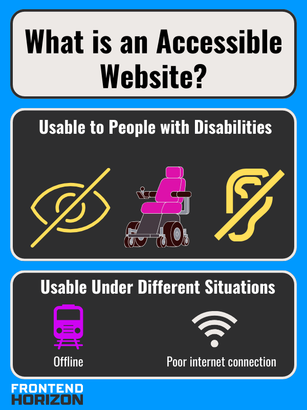
Your website should be accessible if you are a business owner. Website accessibility means the site accommodates users with visual, auditory, cognitive, or motor impairments. It also can include accommodating those who have situational obstacles. For example, someone might have a poor internet connection or be unable to play audio[1]. Altogether, accessibility is about making the site usable for as many users as possible.
Every web developer and small business owner should be mindful of accessibility when designing a site. This fulfills ethical or legal obligations, which require that business websites be accessible to people with disabilities. Beyond that, it also improves user experience, boosts search engine rankings, and increases organic traffic. In fact, understanding the broader SEO Ranking Factors can further enhance your site's visibility and performance, aligning accessibility improvements with effective SEO strategies.

ADA Compliance: Inaccessible Websites are a Legal Risk
The Americans with Disabilities Act (ADA) is legislation that prohibits discrimination against individuals with disabilities.
If you’re a business owner, you should be aware of Title III of the Americans with Disabilities Act, which “prohibits discrimination based on disability in places of public accommodation”[2]. This can include websites. As a business, you can face lawsuits for not being ADA compliant if you’re offering an app, product, or service on your website (especially if you don’t also have a brick-and-mortar location)[2], [3], [4] Non-compliance with ADA guidelines can lead to legal challenges and financial penalties.
Several high-profile lawsuits have highlighted the risks of ignoring accessibility requirements. Netflix was sued by the National Association of the Deaf for not providing closed captions in their videos. Blue Apron, a meal kit service, got sued for poor website accessibility because they don’t have an accessible brick-and-mortar location. Nike and Five Guys Burgers and Fries were sued in 2017 for not providing an accessible website for the visually impaired. Fox News Network, Burger King, Domino’s Pizza, and even Amazon have also been sued for not accommodating visually impaired users enough[5].
In addition to the ADA, businesses who receive federal funds should also know about the Rehabilitation Act of 1973. This was the first U.S law that prevented discrimination against people with disabilities. It was amended in 1998 with the addition of section 508, which prevents discrimination on websites[3].
How Website Accessibility Relates to SEO

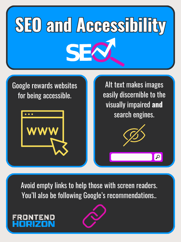
Google can boost accessible websites because user experience is weighed in Google Search’s algorithm[6]. Despite this, many websites do not fulfill accessibility requirements. In a 2020 study, Web Aim’s WAVE accessibility engine found that over 96% of web pages failed its accessibility test. This was often a result of having text that was too low contrast, empty links, and missing alternative text on images[1].
Two of these, alt text and links, are things that should be optimized already for SEO regardless of accessibility.
“Alt text” (or “Alternative Text”) is a short description of an image in case it can’t be seen or won’t load. It makes it so that screen reader users can understand images. For SEO, it also helps web crawlers place an image in context so that people can find your website through image search[1]. Although image recognition via AI is improving, writing alternative text is low-hanging fruit to improve SEO and accessibility.
Empty links are links without any text that tells you where you’ll end up if you click on the link. It’s possible to have an empty link because of the structure of HTML. In HTML, you write a link with an anchor (<a>) tag that goes around descriptive text.
Like so:
<a href=”url-to-go-to.com” >descriptive text</a>
The descriptive text should hint at where you will be redirected to if you click on the link. Here is an example:
<a href=”www.website/image_of_dog”>picture of a dog</a>
In this example, the descriptive text is “picture of a dog” and when you click on it, it should lead to a page that shows a dog. Unfortunately, HTML allows you to just place anchor tags with no text between as well:
<a href=”www.website/image_of_dog”></a>
You might do this if you thought it would be cool to make an image with a link or if you were feeling lazy. Regardless, it makes it so that anyone with a screen reader doesn’t know where the link is going to go[7]. And it doesn’t do anything to benefit web crawlers either. Google’s own documentation discourages empty links[8]. Sometimes it is ambiguous whether certain SEO techniques work (such as longer domain registration lengths), but when a tip is included in Google’s own documentation: don’t skip it.
Ways to Improve Website Accessibility
To ensure your website is accessible, it's important to follow the Web Content Accessibility Guidelines (WCAG). Many of the requirements are about making sure your website is compatible with assistive technologies such as screen readers, refreshable braille displays, screen magnifiers, accelerators, on and off-screen keyboards, joysticks, eye tracking, and voice recognition[9].
Modifications and Tests Related to Visual Accessibility
There are many changes that you can make to improve accessibility for those who are visually impaired (blind, partially blind, or color blind).
Sufficient Color Contrast
Having sufficient contrast between text and its background is always necessary for any user base. However, you can increase contrast to accommodate more users. To check whether your contrast is accessible you can use a contrast checker. You want to have a ratio that is 4.5:1 or higher[10].
Use Large and Easy to Read Fonts
Some easy to read fonts are Times New Roman, Verdana, Arial, Tahoma, Helvetica, Calibri, and Georgia[11]. Make your body text size be 16px [12].
Check How the Site Looks for Color Blind Users
You can view what your page looks like for different types of colorblindness using tools like Toptal’s filter [10].
Don’t rely only on color to provide Information[10]
While color is a good way to convey information (like green for “yes” and red for “no”), you shouldn’t rely on it. Include text and symbols in addition to color in graphs or infographics[10]. You can always use filters to check out how a page or image looks if a user is colorblind .
Include alt text (“alternative text”) for all non-decorative images[10]
Alternative text is a short description of an image. When a blind person uses a screen reader it reads the alt text to them.
When you write alt text:
- You can skip “image of” or “photo of”.
- Leave decorative images blank[13]
- Keep it short. A short sentence fragment that is less than 125 characters is fine[14].
- It should be specific: “siamese kitten playing with mouse toy” is better than “cat”
- It should give context to the image[14]
- You can use keywords, but don’t stuff them. This means your alternative text should make sense (think of a phrase that would place an image in one’s mind rather than a list of synonyms).
Forms should have accurate labels for each field and instructions.
This is to ensure that the form can be understood with a screen reader. It should also have alerts to tell someone that there is an error[10].
Modifications Related to Audio Accessibility
There are a few website changes that can assist those who are deaf or hearing impaired.
- If you have video or audio provide a transcript or closed captions.
- Include an email or live chat instead of just a phone number in your contact information[15].
- If your page includes a media player, make sure it has controls so volume can be adjusted[15].
Modifications Related to Motor Accessibility
For those with limited motor ability (specifically trouble using their hands or complete loss of use) there are many accessibility options.
Make Popups Easy to Control - Websites often have content that reveals itself (like tooltips) when a mouse hovers over or clicks on an object. With limited motor control, these elements can cause frustration because they can either disappear too quickly or block things behind it. To prevent this issue:
- Make sure you can dismiss the popup with just a keyboard command so someone doesn’t have to move the mouse to close it.
- You should also include a visual close button (“x”) on the popup.
- The revealed object should only appear when the mouse pointer is over the object.
- It should disappear when the mouse is not hovered over it. It should not disappear or time out if the mouse is still over the object[16].
Other Tips
- Add keyword shortcuts for those who don’t use a mouse.
- Gesture controls should only be for simple gestures (like swiping on your phone). If you can’t navigate your website with one finger, that isn’t good.
- Ensure that users can undo actions in case they touch something by mistake.
- Enable autocompletion to minimize the amount of typing necessary.
- Sessions should not quickly time out if users have to input information. While this is sometimes important for security, you should give warnings that the session is almost over and give them the option to extend that time[17].
Other Site Changes for Accessibility

Navigation
Clear and consistent navigation helps all users find the information they need (it is also a boon for web crawlers). You can improve your website’s navigation by using semantic HTML and good heading structure.
Semantic HTML
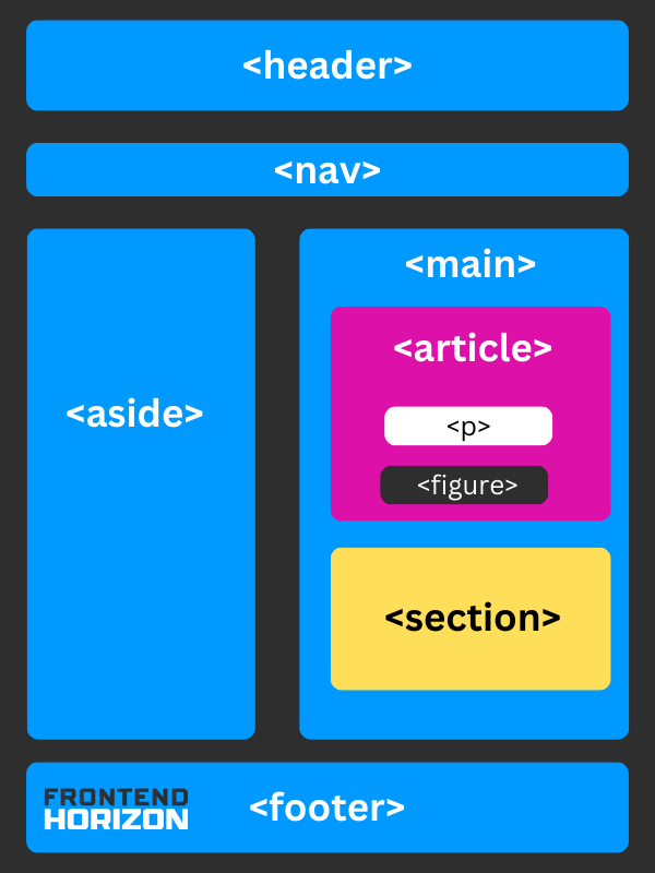
Semantic HTML helps people who use assistive technologies (such as screen readers) understand the structure of your website. A semantic HTML tag is a tag with a name that describes the content inside of it[18]. For example, the tag <nav> signifies a navbar, <article> means article, and a <footer> is a footer. In contrast, nonsemantic HTML doesn't describe what is in it. A good example is <div>. What's in a div? Something. I don't know. It is basically a block of stuff. *shrugs*
Options for semantic HTML tags can be separated into two categories:
Major Tags - Tags that hold large parts of a page and define its main structure. Other tags are nested inside these:
- <header> - Header is where you are likely to find a heading or two (H1) like the title of a page. You might also find a logo and, if it’s an article, information about an author[19]. It goes at the top of a page.
- <nav> - Place links to navigate to the main sections of your website within <nav> tags.
- <aside> - Use an aside tag if you would like to have a sidebar on your site.
- <main> - All main content goes inside the main.
- <footer> - The footer is placed at the bottom of a page. You would put things like contact information and copyright information in this area[19].
Minor Tags - Tags that are subsections that would normally go inside Major Tags
- <article> - The article tag surrounds content that can exist on its own. A full newspaper article or full blog post for content marketing would go inside an article. Articles can also be used to enclose user comments on posts or information about a product[19].
- <figure> and <figcaption> - A figure tag surrounds an image tag (<img>) and its corresponding figure caption (<figcaption>).
- <mark> - The mark tag can be used to emphasize or highlight text within a paragraph (<p>). It is up to the developer to overwrite the default style of a yellow highlight with CSS[20]. It is a useful tool for emphasis.
- <time> - Put dates in a <time> tag.
- <summary> and <details> - The <summary> tag is a header within the <details> tag that you can click on to reveal more details or hide them.
- <p> - Place all paragraphs in <p> tags
- <section> - A section is for content that is thematically grouped. You could use a section for a chapter in an online book, and instruction, or for enclosing contact information[19].
Do Headings Matter?
Using Headings
Like semantic structure, using headings properly also helps users navigate. Headings have rankings of decreasing rank: H1, H2, H3, H4, H5, and H6 (etc.). They should be nested and used in order. Sections of equal rank get equal headings. You can also use headings as a place to put relevant keywords.
Let's say we’re writing a very long chapter-by-chapter review of a three-part book series in one web page. The sections could be organized like below. Notice that the H tags are ordered, even if they start over. So, you won't see a jump from an H3 tag to H5 without an H4 proceeding it.
H1: A Review of The Lord of the Rings
H2: The Fellowship of the Ring
H3: Book 1
H4: Chapter 1: A long-expected party
H5: Summary
H5: Analysis
H3: Book 2
H4: Chapter 1: Many Meetings
H5: Summary
H5: Analysis
H2: The Two Towers
H3: Book 3
H4: Chapter 1: The Departure of Boromir
H5: Summary
H5: Analysis
H3: Book 4
H4: Chapter 1: The Taming of Sméagol
H5: Summary
H5: Analysis
H2: The Return of the King
H3: Book 5
H4: Chapter 1: Minas Tirith
H5: Summary
H5: Analysis
H3: Book 6
H4: Chapter 1: The Tower of Cirith Ungol
H5: Summary
H5: Analysis
In this example, the parts of the book are arranged in hierarchical order. From H1 descending to H5 tag.
Website Accessibility Testing Resources
For more information about accessibility requirements, you should explore wcag.com and w3.org.
WAVE (Web Accessibility Evaluation Tool)
The WAVE Web Accessibility Evaluation Tool allows you to scan individual web pages for accessibility issues. It provides visual feedback and highlights areas that need attention. WAVE also offers browser extensions for Chrome, Edge, and Firefox.
Here is how it looks when I use it for Time Magazine.

WebAIM Contrast Checker
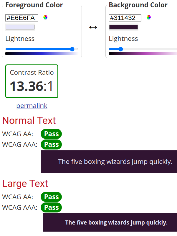
For improving contrast, you can use a WebAIM contrast checker to compare the color of your text to its background color. Here are the results for lavender (#E6E6FA) and eggplant ( #311432), which has enough contrast.

LERA Chrome Extension
LERA has an attractive user interface and provides a downloadable Excel file after scanning your site[21]. Below are the results for Britannica.com.

Bullet Summary
- Accessibility makes your site usable to all users regardless of disability or situation.
- It benefits your SEO.
- It protects your business from being sued.
- It encompasses many topics like navigation, alt text, and forms.
- You can explore these using WCAG And W3.org and by using accessibility testing tools.
References
[1] R. Everett, “How & Why Accessibility Matters for SEO,” Search Engine Journal. Accessed: Dec. 01, 2023. [Online]. Available: https://www.searchenginejournal.com/seo-accessibility/379582/
[2] “Title III of the Americans with Disabilities Act and Website Compliance.” Accessed: Dec. 12, 2023. [Online]. Available: https://www.americanbar.org/groups/gpsolo/publications/gpsolo_ereport/2022/february-2022/title-iii-americans-disabilities-act-website-compliance/
[3] “Overview of website accessibility laws and regulations,” Siteimprove. Accessed: Dec. 12, 2023. [Online]. Available: https://www.siteimprove.com/glossary/accessibility-laws/
[4] “The Impact of ADA Web Compliance on Small Businesses.” Accessed: Aug. 23, 2023. [Online]. Available: https://www.gosite.com/blog/ada-compliant-website-small-business
[5] L. Access, “Title III Lawsuits: 10 Big Companies Sued Over Website Accessibility,” Level Access. Accessed: Dec. 12, 2023. [Online]. Available: https://www.levelaccess.com/blog/title-iii-lawsuits-10-big-companies-sued-over-website-accessibility/
[6] “Understanding Google Page Experience | Google Search Central | Documentation,” Google for Developers. Accessed: Dec. 01, 2023. [Online]. Available: https://developers.google.com/search/docs/appearance/page-experience
[7] “Empty link - Web Accessibility Guidelines.” Accessed: Dec. 01, 2023. [Online]. Available: https://stevenmouret.github.io/web-accessibility-guidelines/accessibility/links/empty-link.html
[8] “SEO Link Best Practices for Google | Google Search Central | Documentation,” Google for Developers. Accessed: Dec. 01, 2023. [Online]. Available: https://developers.google.com/search/docs/crawling-indexing/links-crawlable
[9] W. W. A. Initiative (WAI), “Tools and Techniques,” Web Accessibility Initiative (WAI). Accessed: Dec. 01, 2023. [Online]. Available: https://www.w3.org/WAI/people-use-web/tools-techniques/
[10] “Guidance on Web Accessibility and the ADA,” ADA.gov. Accessed: Aug. 29, 2023. [Online]. Available: https://www.ada.gov/resources/web-guidance/
[11] “What makes a good, accessible, easy to read font? - @GatherContent,” GatherContent. Accessed: Jan. 03, 2024. [Online]. Available: https://gathercontent.com/blog/what-makes-a-good-accessible-easy-to-read-font
[12] “Minimum font size?,” Accessible Web. Accessed: Jan. 03, 2024. [Online]. Available: https://accessibleweb.com/question-answer/minimum-font-size/
[13] “Write helpful Alt Text to describe images.” Accessed: Dec. 01, 2023. [Online]. Available: https://accessibility.huit.harvard.edu/describe-content-images
[14] “Alt Text: What Is It & Why It Matters for Accessibility & SEO,” Semrush Blog. Accessed: Jan. 03, 2024. [Online]. Available: https://www.semrush.com/blog/alt-text/
[15] “Deaf Accessibility: Web Accessibility For Hard-of-Hearing Users,” Accessibility Checker. Accessed: Dec. 12, 2023. [Online]. Available: https://www.accessibilitychecker.org/blog/deaf-accessibility/
[16] “✎ Technique: Content on hover or focus.” Accessed: Dec. 12, 2023. [Online]. Available: https://accessibility.huit.harvard.edu/technique-content-hover-or-focus
[17] “Motor impairment | Digital Accessibility.” Accessed: Dec. 12, 2023. [Online]. Available: https://accessibility.huit.harvard.edu/disabilities/motor-impairment
[18] “Semantic HTML: What It Is and How to Use It Correctly,” Semrush Blog. Accessed: Dec. 05, 2023. [Online]. Available: https://www.semrush.com/blog/semantic-html5-guide/
[19] “HTML Semantic Elements.” Accessed: Dec. 06, 2023. [Online]. Available: https://www.w3schools.com/html/html5_semantic_elements.asp
[20] “HTML mark Tag.” Accessed: Dec. 06, 2023. [Online]. Available: https://www.w3schools.com/tags/tag_mark.asp
[21] A. Bikkani, “10 Awesome Web Accessibility Testing Tools for Websites,” Advancedbytez. Accessed: Dec. 05, 2023. [Online]. Available: https://advancedbytez.com/web-accessibility-testing-tools-for-websites/


